Choosing a dining room paint color feels exciting until you’re standing in the paint aisle holding 12 swatches, second-guessing everything. Will it clash with your table? Look too dark at night? Feel wrong once it’s on the wall?
You’re not alone — this is one of the most common decorating dilemmas women face. The good news? It doesn’t have to be this hard.
These 9 tried-and-true dining room paint color ideas are chosen to match real homes, real furniture, and real life — so you can finally pick with confidence and fall in love with your dining room all over again.
Table of Contents
Products You’ll Need Before You Start
- Samplize Peel-and-Stick Paint Samples — Try real paint colors directly on your wall without the mess of traditional samples.
- Frog Tape Multi-Surface Painter’s Tape — Delivers razor-sharp edges so your paint job looks clean and professional every time.
- The Color Wheel Company Color Wheel Tool — Helps you match and coordinate your wall color with furniture and décor effortlessly.
- Paint Sheen & Finish Reference Guide Book — Takes the guesswork out of choosing the right finish (matte, eggshell, satin) for dining room walls.
- Styled: Secrets for Arranging Rooms by Emily Henderson — A practical styling guide to help you pull your entire dining room look together after painting.
1. Dusty Sage Serenity
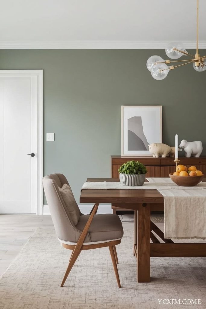
Dusty sage is the color equivalent of a deep breath. It’s soft, earthy, and immediately makes a dining room feel grounded and calm — perfect for families who want mealtimes to feel like a genuine pause from the chaos of the day.
This muted green works beautifully with warm wood tones like walnut and oak, white or linen table linens, and brass or gold light fixtures. It suits nature-lovers, minimalists, and anyone drawn to the popular organic modern aesthetic.
Natural light makes it glow warmly during the day, while warm bulbs at night give it an almost candlelit quality.
Pinterest-worthy tip: Style your table with a simple linen runner, a wooden bowl of fruit, and a brass candleholder to make this color truly sing on camera.
2. Warm Terracotta Embrace
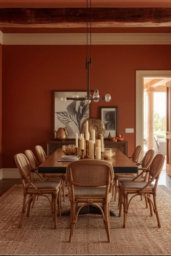
Terracotta is having a major moment — and for good reason. This rich, clay-inspired tone wraps a dining room in instant warmth, making guests feel welcomed the second they walk in.
It pairs magnificently with rattan furniture, dark wood floors, cream-colored ceiling trim, and woven textiles. If you love bohemian, Mediterranean, or southwestern-inspired interiors, this is your color.
It’s also incredibly forgiving in low-light dining rooms, because it actually deepens and becomes more beautiful by candlelight. Women who want their dining space to feel soulful, collected, and full of personality consistently fall in love with terracotta.
Pinterest-worthy tip: Place a cluster of pillar candles on the table at golden hour and photograph the wall behind them — the warm glow against terracotta is pure magic.
3. Creamy Butter Softness
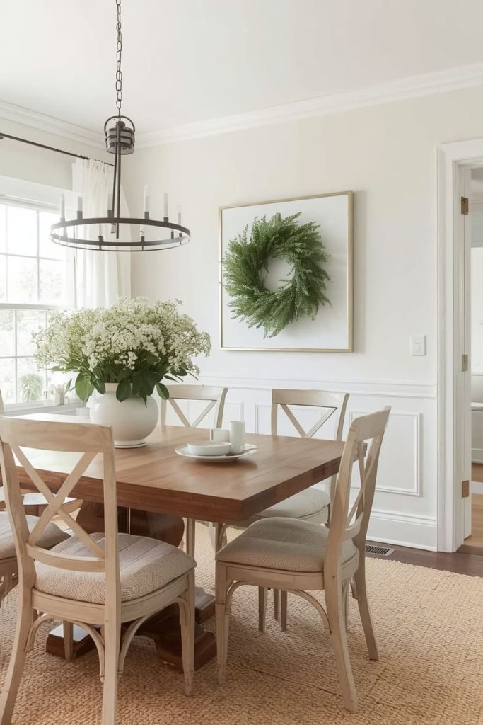
If you’ve always played it safe with white but secretly craved something with more personality, creamy butter is your answer. It’s white’s warmer, cozier cousin — subtle enough to feel neutral but rich enough to add genuine character.
This shade works with virtually every furniture color, from dark espresso to light natural wood, and makes a space feel sunny even on grey days. It’s ideal for traditional, cottage, or transitional home styles.
Young families especially love it because it feels clean and bright without the starkness of a true white. It also photographs beautifully, making it a perennial favorite in Pinterest dining room content.
Pinterest-worthy tip: Hang a simple wreath or greenery on a neutral wall nearby to add an organic contrast that makes the butter tone pop in photos.
4. Moody Navy Elegance
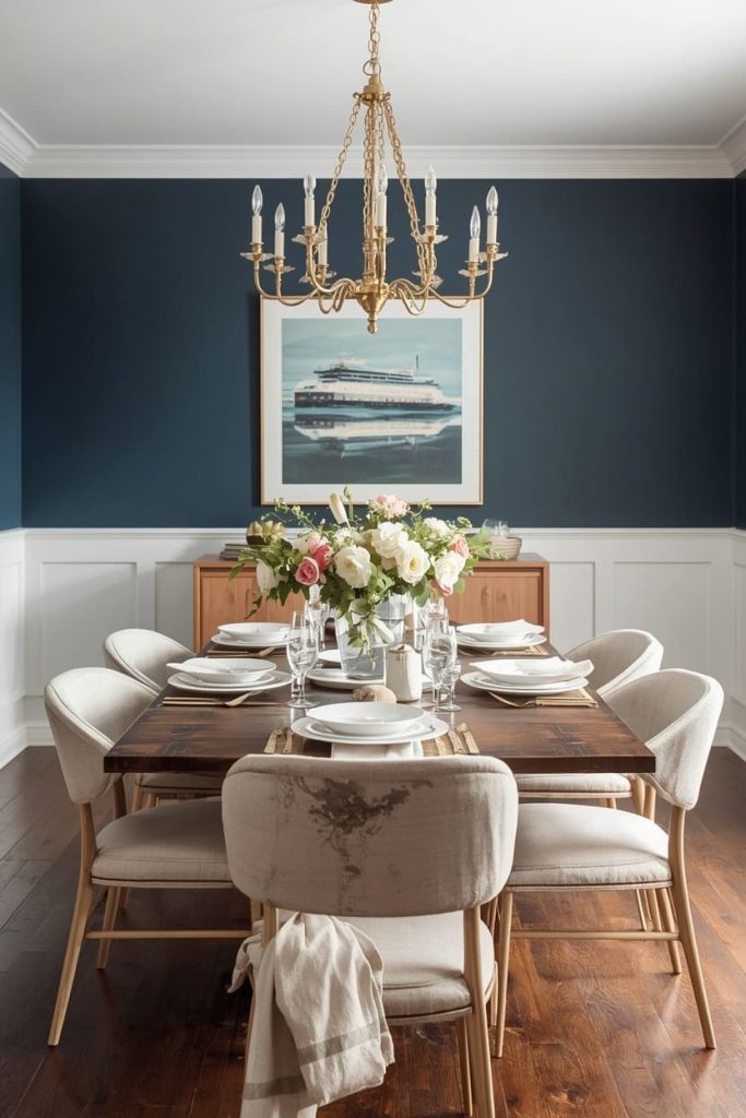
Navy is the color choice of someone who’s done playing small with her dining room. Deep, dramatic, and undeniably sophisticated, it transforms an ordinary dining space into something that feels curated and intentional. It works best in rooms with good lighting — natural light during the day, a statement chandelier at night.
Pair it with white wainscoting, brass hardware, white or cream dinnerware, and light-toned wood furniture to keep it from feeling heavy. This shade suits women with a love for classic, coastal, or modern traditional interiors.
Don’t be afraid of it — navy on a dining room wall is consistently one of the most-saved colors on Pinterest.
Pinterest-worthy tip: Set the table with white plates, linen napkins, and fresh flowers in a clear vase — the contrast against navy creates a jaw-dropping, editorial-worthy photo.
5. Blush Rose Warmth
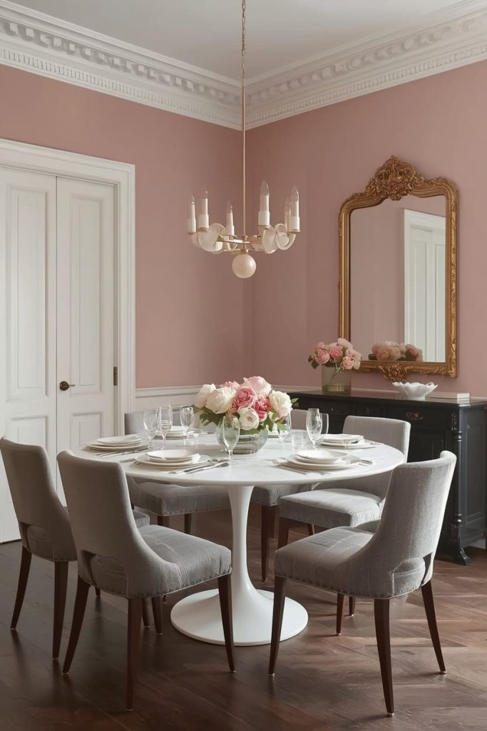
Blush in a dining room is not babyish — when done right, it’s one of the most sophisticated and unexpected choices you can make.
Think less bubble-gum and more faded European plaster wall. This muted, grown-up pink creates a deeply romantic atmosphere that makes every dinner feel a little special.
It pairs beautifully with marble tabletops, gold or rose gold light fixtures, velvet chairs in grey or cream, and dark hardwood floors. It suits women who love romantic, Parisian, or maximalist-chic aesthetics.
Blush also photographs with a gorgeous warmth that makes food and table settings look almost editorial.
Pinterest-worthy tip: Add a vintage-style mirror on an adjacent wall and fresh pink or white peonies on the table to create a dreamy, high-engagement Pinterest image.
6. Charcoal Sophistication
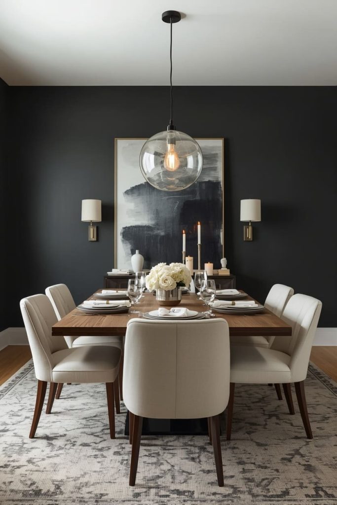
Charcoal is bold, but it rewards bravery. Far less stark than black but with all the drama, charcoal creates a dining room that feels like a private, luxurious retreat. It’s especially stunning in dining rooms used primarily for evening entertaining, where low lighting makes the walls recede and your table setting becomes the star of the show.
Pair it with light wood furniture, white or cream upholstered chairs, metallic accents, and statement pendant lights. This color suits women who gravitate toward modern, industrial, or contemporary glam interiors. It also makes artwork and wall décor pop like nothing else.
Pinterest-worthy tip: Light the room with warm Edison-style bulbs or candles only and photograph the table setting — charcoal walls create an incredibly moody, magazine-worthy backdrop.
7. Warm Greige Balance
Greige — the perfect blend of grey and beige — is the ultimate “I want a neutral but not a boring one” solution. It’s endlessly versatile, works in every lighting condition, and complements practically every furniture color and wood tone in existence.
If you’re someone who redecorates frequently or isn’t ready to commit to a bold color, greige gives you a sophisticated, polished base that makes everything else in the room look more intentional.
It suits transitional, Scandinavian, and modern farmhouse interiors especially well. It’s also one of the safest choices if you’re planning to sell your home, as it appeals to a very wide range of buyers.
Pinterest-worthy tip: Layer different textures — a woven placemat, ceramic dinnerware, a linen tablecloth — to add visual interest against the understated greige backdrop.
8. Forest Green Richness
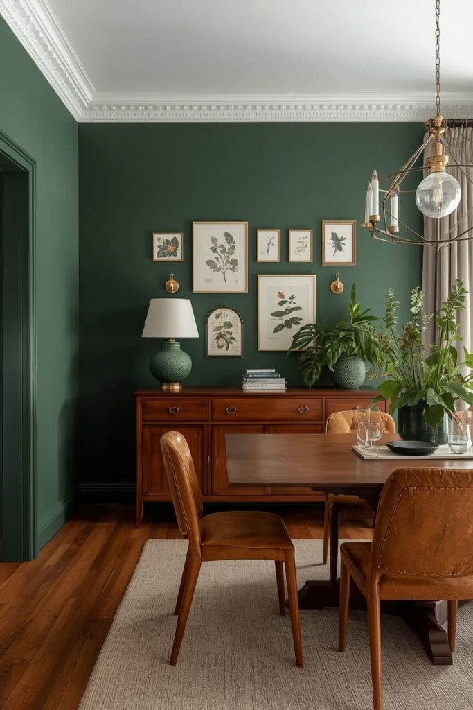
Deep forest green is one of those colors that looks like it belongs in a design magazine the moment it hits your wall. It’s earthy yet refined, bold yet natural — and it creates a dining room that feels like a grown-up sanctuary. It works beautifully with dark wood furniture, antique brass or matte black fixtures, leather or velvet seating, and warm Edison lighting.
If you love maximalist, vintage, or romantic dark academia aesthetics, this is your color. It’s particularly stunning in dining rooms with crown molding or wainscoting, as the architectural details seem to come alive against such a rich backdrop.
Pinterest-worthy tip: Style a gallery wall with vintage-style botanical prints above a sideboard to create an incredibly cohesive, richly layered Pinterest moment.
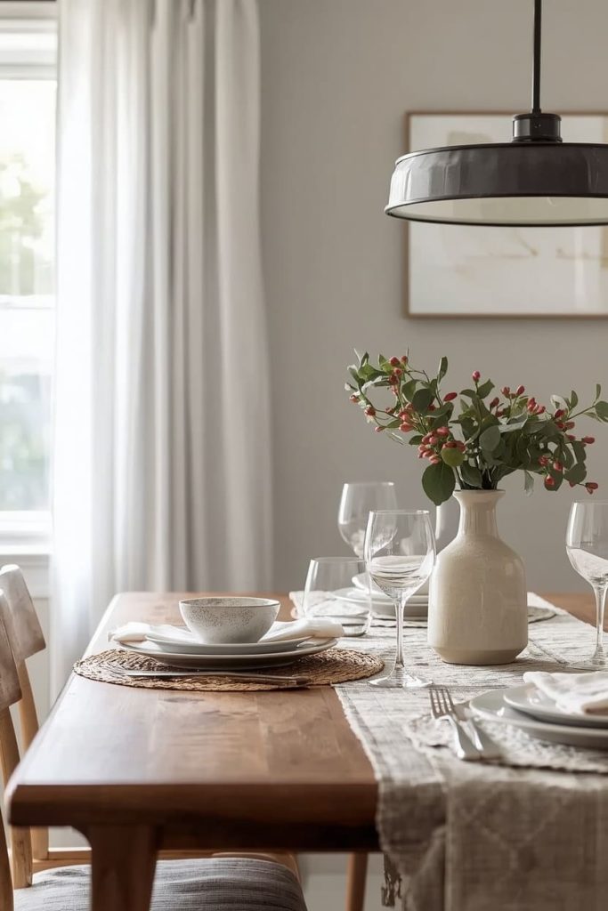
9. Soft White Linen Calm
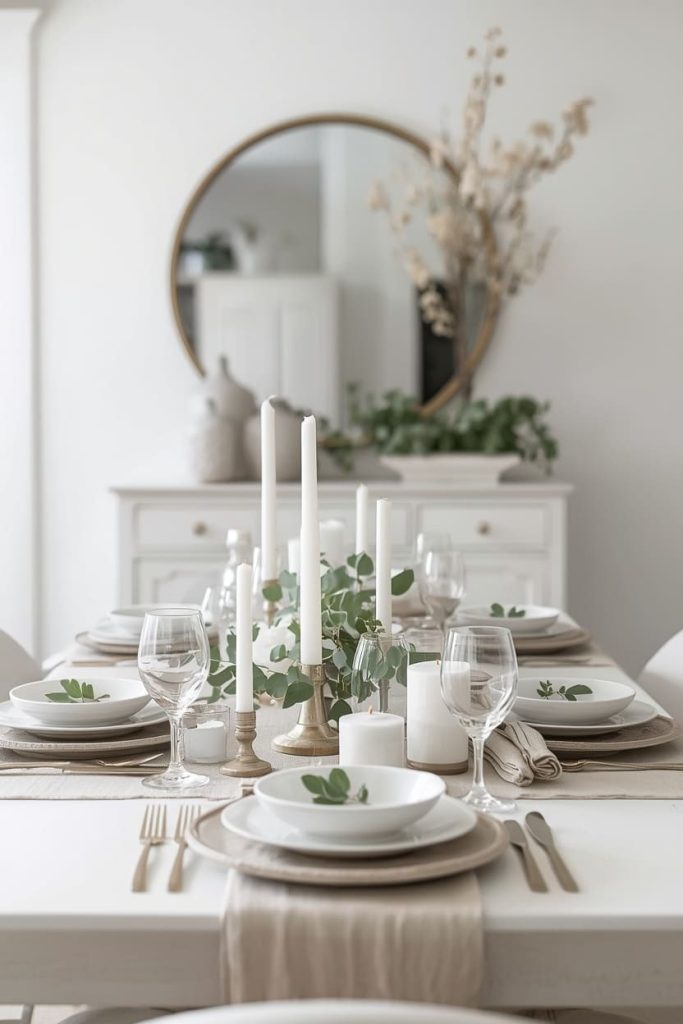
Never underestimate the power of the right white. Not a cold, bluish white — but a soft, warm white with subtle linen or grey undertones that makes a space feel airy, clean, and endlessly inviting.
This shade is the top choice for women who want their dining room to feel open and light without sacrificing warmth. It works with every style from farmhouse to contemporary, every furniture color, and every season’s décor.
It’s also the most flexible backdrop for tablescaping and seasonal decorating — swap your centerpieces and linens and the room feels completely transformed each time.
Pinterest-worthy tip: Fill the table with a mix of white candles in varying heights, fresh eucalyptus, and simple white dinnerware for a clean, airy flat-lay that performs exceptionally well on Pinterest.
You’ve Got This
Your dining room deserves to be a space you’re genuinely proud of — somewhere that sets the mood before the first bite is even taken.
Stop overthinking the swatches and trust your instincts. Pick the color that made you feel something when you read about it.
Then grab your painter’s tape, order those peel-and-stick samples, and take that first step. Your dream dining room is closer than you think.

Jenny is a passionate writer specializing in home decor, design, and styling. With years of experience in transforming spaces, she shares expert tips on creating beautiful, functional homes. From interior design trends to DIY decor ideas, Jenny’s work helps homeowners craft spaces that reflect their unique style. Whether it’s a cozy living room, a modern kitchen, or a serene bedroom, her articles offer practical advice and inspiration to elevate any home.