I once spent three weeks staring at paint swatches taped to my dining room wall, completely unable to commit. I had seventeen different samples up there — seventeen — and every time I thought I had found the one, the light changed and I talked myself out of it all over again.
I finally picked a cool grey that looked sophisticated in the tin and utterly lifeless on my walls. I lived with it for eight miserable months before repainting. That experience taught me more about color than any design book ever could.
If you are standing in your dining room right now feeling overwhelmed and indecisive, I want you to know that feeling is completely normal — and these seven tried and tested color schemes will give you the clarity to finally commit.
Table of Contents
My Favorite Dining Room Color Scheme Picks on Amazon
- Peel-and-Stick Paint Sample Cards (Large Format) — These oversized swatches let you test multiple colors directly on your wall in real light before committing to a single drop of paint.
- Linen Curtain Panels in Warm White — A pair of soft warm-white linen curtains works as a neutral anchor that complements virtually every dining room color scheme on this list.
- Sage Green Ceramic Dining Accessories Set — This understated ceramic set in muted sage brings an earthy, organic accent color to your table that ties together both warm and cool color palettes beautifully.
- Striped Cotton Table Runner in Terracotta and Cream — This warmly toned runner instantly introduces the earthy, layered quality that makes a color scheme feel intentional and complete.
- Tall Sculptural Vase in Dusty Blue — A statement vase in dusty or muted blue works as the perfect accent piece to ground and complete a warm neutral or earthy dining room palette.
The 7 Ideas
Warm and Earthy
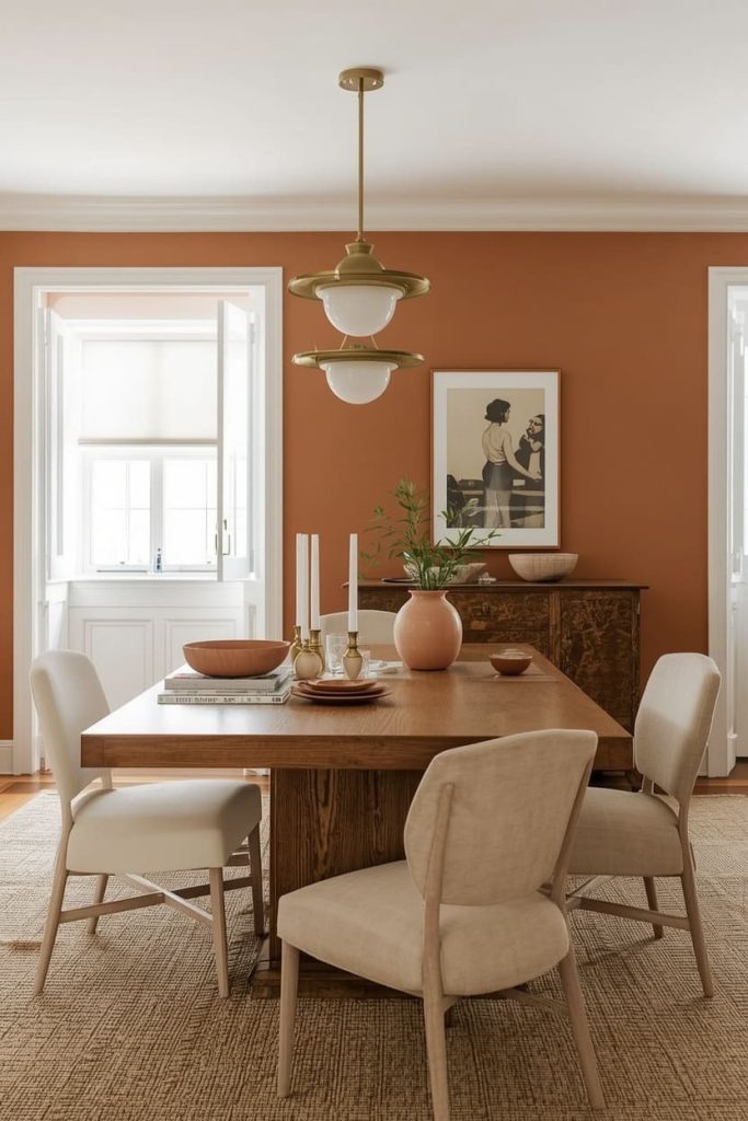
This is the color scheme I wish I had chosen the first time around, and it is the one I recommend most often to friends who are starting from scratch.
Warm, earthy tones — think terracotta, burnt sienna, warm sand, and raw clay — create a dining room that feels deeply welcoming and genuinely timeless.
These are colors that have been used in homes for centuries, and they show absolutely no signs of dating.
For walls, I love Sherwin-Williams’ Antique White as a warm base, or if you are ready to go bolder, Benjamin Moore’s Pale Terra Cotta is a beautiful, liveable terracotta that glows under candlelight without overwhelming the space.
Pair earthy walls with natural wood furniture in oak or walnut tones, linen or cotton soft furnishings in cream and sand, and brass or brushed gold hardware and lighting.
Terracotta ceramic accessories on the table — a simple bowl, a pair of candleholders, a low vase — will pull the whole scheme together beautifully. This palette works in every light condition and suits both modern and traditional dining room furniture equally well.
Sage and Cream
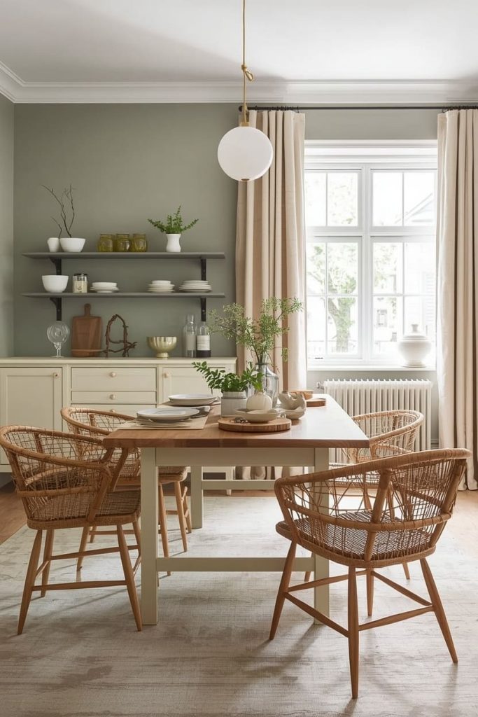
If there is one color scheme that has defined the last few years of interior design and still feels completely fresh, it is sage green paired with warm cream.
There is something about this combination that feels simultaneously modern and deeply rooted — like a farmhouse kitchen that has been quietly updated without losing any of its soul.
I have seen it work in tiny terraced house dining rooms and in grand open-plan spaces, and it is consistently one of the most liveable and universally flattering schemes you can choose.
For the walls, Farrow & Ball’s Mizzle is a beautiful complex sage with grey and green undertones that shifts beautifully in different lights. If you want something a little warmer and more yellow-green, Sherwin-Williams’ Clary Sage is a wonderful alternative that leans slightly more herbal and organic.
Pair sage walls with cream or off-white painted furniture, natural oak or rattan chairs, and warm white linen curtains. On the table, bring in cream ceramics, wooden serving boards, and small pots of fresh herbs or dried botanicals for a finishing touch that feels genuinely considered.
Avoid cool white with this scheme — it will fight the warmth of the sage rather than complement it.
Navy and Brass
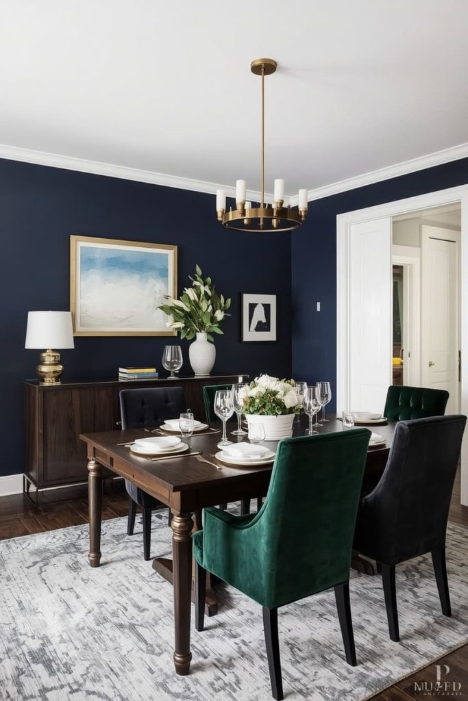
For anyone who wants a dining room that feels genuinely sophisticated and a little glamorous without tipping into overwhelming, navy and brass is one of the most reliable and rewarding color combinations in existence.
Navy is one of those rare dark colors that reads as both bold and neutral simultaneously — it anchors a room with confidence while still allowing everything else in the space to shine. And when you add brass into the mix, the whole scheme lifts into something that feels genuinely special.
Benjamin Moore’s Hale Navy is my go-to recommendation here — it is a classic, slightly warm navy that avoids the cold, corporate feeling that some darker blues can have. Farrow & Ball’s Stiffkey Blue is another beautiful option with a slightly more complex, almost greenish undertone that is deeply atmospheric.
Paint all four walls for maximum impact, and then let your brass do the heavy lifting through your light fixture, cabinet hardware, picture frames, and cutlery.
Pair with dark walnut or ebony-stained wood furniture, velvet dining chairs in a complementary deep tone like forest green or burgundy, and crisp white tableware that pops beautifully against the dark backdrop.
This scheme photographs extraordinarily well, which makes it a perennial Pinterest favourite for good reason.
Soft Blush Tones
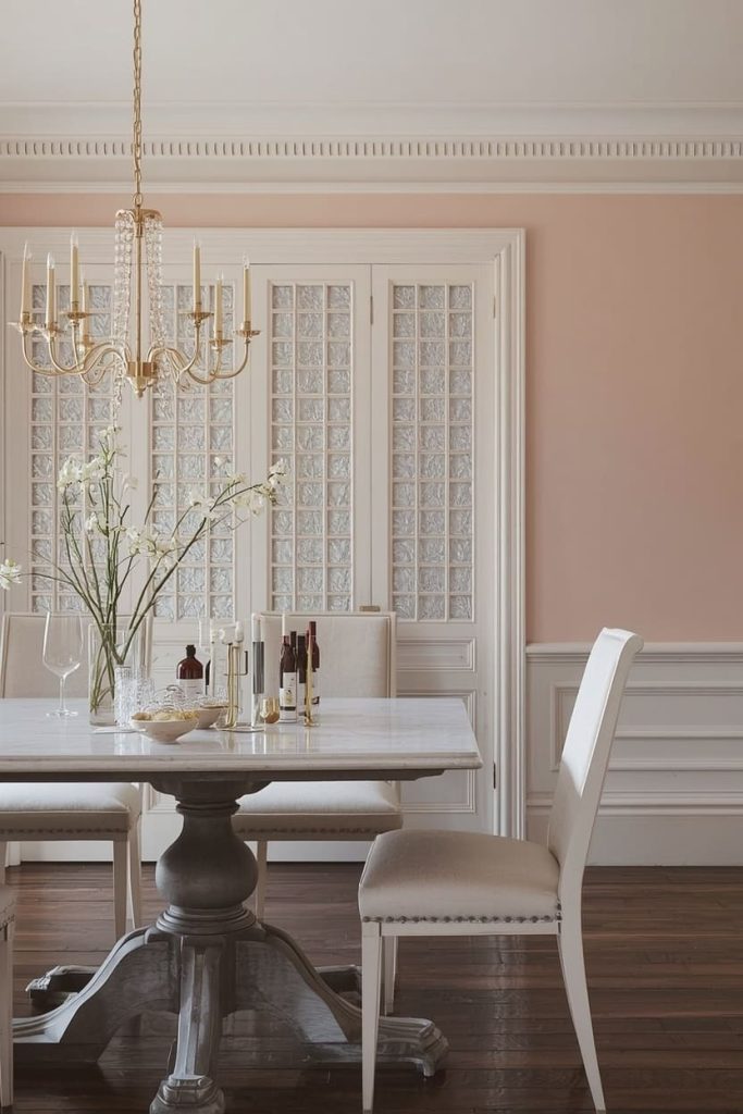
Blush is one of those colors that many people dismiss as too feminine or too trend-driven, and I understand that hesitation — but a well-chosen, muted blush is one of the warmest and most flattering wall colors you can put in a dining room.
The key is avoiding anything too pink or too saturated. You are looking for a blush that reads almost as a warm neutral in certain lights — something that makes the people sitting in the room look wonderful and the food on the table look even more appetizing.
Farrow & Ball’s Setting Plaster is the gold standard here — a sophisticated, dusty rose with enough grey in it to feel genuinely grown-up rather than saccharine. Benjamin Moore’s Pale Blush is a slightly lighter, airier alternative if you want something that feels more fresh than cosy.
Pair blush walls with warm white or cream painted furniture rather than stark white, which can make the blush read as too pink by contrast. Natural linen textiles, light oak or whitewash wood furniture, and matte gold or antique brass accents are the perfect companions.
Add deep burgundy or wine-toned florals as a table centerpiece to ground the softness with a little drama.
Charcoal and White
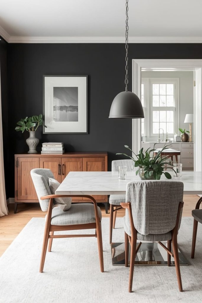
There is a reason charcoal and white has been a design staple for decades — it is endlessly versatile, perpetually sophisticated, and works in dining rooms of every size, style, and period.
Unlike pure black and white, which can feel stark and graphic, charcoal and white has just enough warmth and depth to feel genuinely liveable and inviting. It is the scheme I recommend to people who love the idea of a bold, dramatic dining room but are nervous about committing to something as intense as full navy or forest green.
Farrow & Ball’s Railings is a beautiful near-black charcoal with warm undertones that stops it from ever feeling cold or flat. For something slightly lighter and more versatile, Benjamin Moore’s Kendall Charcoal is a softer, more approachable option that works beautifully in both well-lit and lower-light spaces.
Pair charcoal walls with crisp white painted furniture or a white-topped marble dining table for a clean, graphic contrast. Bring warmth into the scheme through natural wood accents, warm-toned brass or matte black hardware, and linen or cotton soft furnishings in off-white or warm grey.
On the table, both white and dark ceramics look stunning against this backdrop, giving you enormous flexibility in how you style the space day to day.
Green and Warm Wood
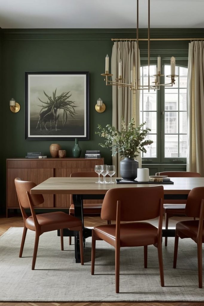
Deep green paired with warm wood tones is one of the most instinctively satisfying color combinations in interior design, and it works in a dining room with a particular kind of magic.
There is something about the combination of botanical green and the natural grain of warm timber that feels both grounded and alive — like bringing the outside in without a single plant in sight.
This is the scheme for people who want a dining room that feels rich and layered but never cold or pretentious.
Farrow & Ball’s Calke Green is a deep, complex green with grey undertones that works beautifully in both period and contemporary dining rooms. For something slightly warmer and more emerald, Little Greene’s Sage Derby or Sherwin-Williams’ Pewter Green are both outstanding options.
Pair your green walls with warm walnut, oak, or teak wood furniture — the contrast between the cool depth of the green and the warm honey of natural wood is deeply pleasing to the eye.
Brass or antique gold lighting and hardware will amplify the warmth, and linen curtains in a warm cream will soften the whole scheme without dulling its impact.
Warm Whites Only
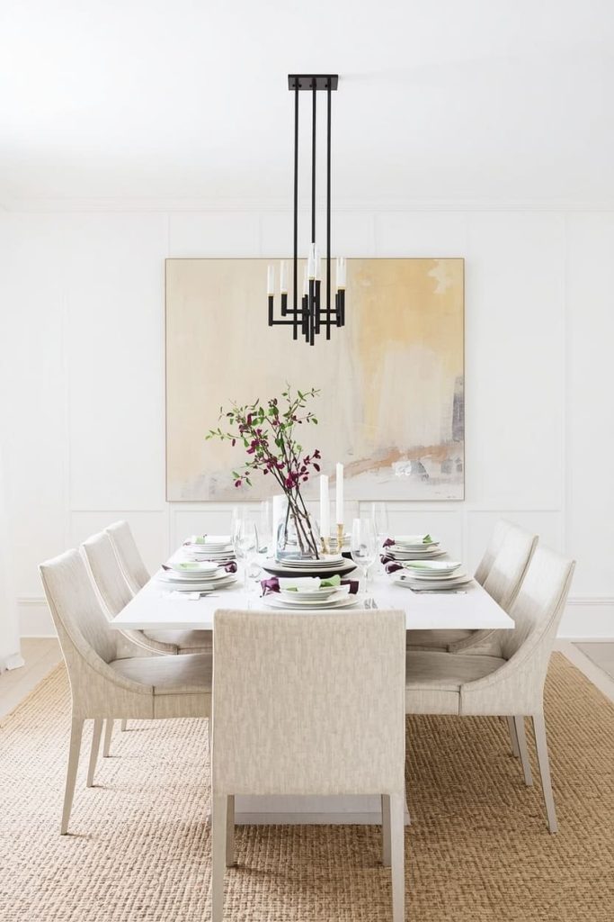
Never underestimate the power of a perfectly chosen warm white. I know it sounds like the safe option — the choice you make when you cannot decide on anything else — but a truly great warm white in a dining room is one of the most sophisticated and intentional things you can do.
The word to hold onto is warm. Cool whites and brilliant whites have no place in a dining room; they make food look less appetizing, they flatten natural light, and they make the whole space feel clinical rather than welcoming.
Benjamin Moore’s White Dove is my all-time favourite warm white for dining rooms — it has just enough warmth to glow beautifully under candlelight while still feeling crisp and clean in full daylight.
Farrow & Ball’s Wimborne White and Sherwin-Williams’ Alabaster are two other outstanding options that hit that perfect balance. The secret to making an all-white scheme feel rich rather than empty is texture — layer linen curtains, a jute or wool rug, wooden furniture with visible grain, and tactile ceramics to give the eye plenty to rest on.
Add one considered accent color through your chair upholstery, a piece of artwork, or a set of colored glassware to stop the scheme from feeling too one-note.
Frequently Asked Questions
How do I know if a paint color will look the same on my walls as it does on the swatch?
The honest answer is that it almost never will — paint swatches are small, held in changing light, and surrounded by the existing colors in your room, all of which affect how you perceive them. The best thing you can do is buy a large peel-and-stick sample or a small test pot and live with a large painted patch on your actual wall for at least three days, observing it in morning light, afternoon light, and under your evening artificial lighting before committing.
Should all the walls in my dining room be the same color?
In most cases, yes — painting all four walls the same color creates a cohesive, immersive effect that feels intentional and considered. The exception is if you want to create a specific feature wall behind your dining table using wallpaper or a significantly darker accent color. If you are going for one of the bolder schemes in this article, color drenching — painting walls, ceiling, and trim all in the same shade — is a technique that looks spectacular and removes the stress of trying to match trim colors.
I love bold colors but I am scared of making an expensive mistake. What should I do?
Start with one wall rather than four, or introduce the bold color through a large piece of furniture — a painted sideboard, an upholstered bench, or a set of velvet dining chairs — before committing to the walls. This gives you a genuine sense of how the color feels in your specific room without the full investment of a paint job. If you love it, paint the walls. If you do not, you have a beautiful piece of furniture rather than a regrettable decorating decision.
What colors make a small dining room feel larger?
Contrary to popular belief, very dark or very saturated colors can actually make a small dining room feel more expansive — not smaller — because they dissolve the hard edges of the walls and replace them with atmosphere. That said, if you genuinely want to maximize the sense of space, warm whites and very light warm neutrals with good natural light and minimal window treatments will always give you the most open, airy result. Mirrors, slim-legged furniture, and a cohesive two-tone palette will do more for a small room than any single paint color.
How do I choose between warm and cool tones for my dining room?
Look at the fixed elements in your room that you are not changing — your flooring, your existing furniture, and the direction your windows face. If your floors are warm-toned (honey oak, warm timber, terracotta tiles), lean into warm paint tones to complement them. If your windows face north and the room gets cool, bluish daylight, warm tones on the walls will counterbalance that beautifully. Cool greys and blues work best in south-facing rooms with plenty of warm natural light to stop them from feeling cold and flat.

Jenny is a passionate writer specializing in home decor, design, and styling. With years of experience in transforming spaces, she shares expert tips on creating beautiful, functional homes. From interior design trends to DIY decor ideas, Jenny’s work helps homeowners craft spaces that reflect their unique style. Whether it’s a cozy living room, a modern kitchen, or a serene bedroom, her articles offer practical advice and inspiration to elevate any home.